
Contextual navigation
our attempt at creating a new contextual navigation architecture that would create a consistent experience for users with different product mixes.

PRoblem
The current app's navigation structure heavily favors users with checking accounts, resulting in poor experiences for those with different product mixes such as credit cards, loans, and lines of credit. This is due to these products not having access to the same features, yet still being presented with them.
Team
The team consisted of the product owner, myself (principal designer), UX researcher, and a copy designer.
My role
My role was to establish a new design strategy for the navigation that would then be dispersed among development pods for implementation and testing.
Challenges
Among the challenges we encountered was a lack of centralized app management, which in turn led to not having access to centralized data sources to inform design decisions.
process

user relationships and user journeys
Initial discovery involved gathering data to comprehend all potential product combinations, identify the most common ones and understand the current user experience. To pinpoint the pain points experienced by these users, I collaborated with research and CX teams to conduct several studies. These studies helped us grasp the expectations of key user groups and document our findings along a journey map. Additionally, I partnered with the QA team to truly experience what they encounter in the app. This enabled us to validate that users with only loans, mortgages, or credit cards cannot access most of the bottom navigation options we offer, as these functions are exclusively available through deposit accounts.
What’s important to our users as they navigate the app?
We have done exploratory research to understand what features do our users use most often to ensure we can provide great access. We have also conducted testing to determine how adverse our users are to change.
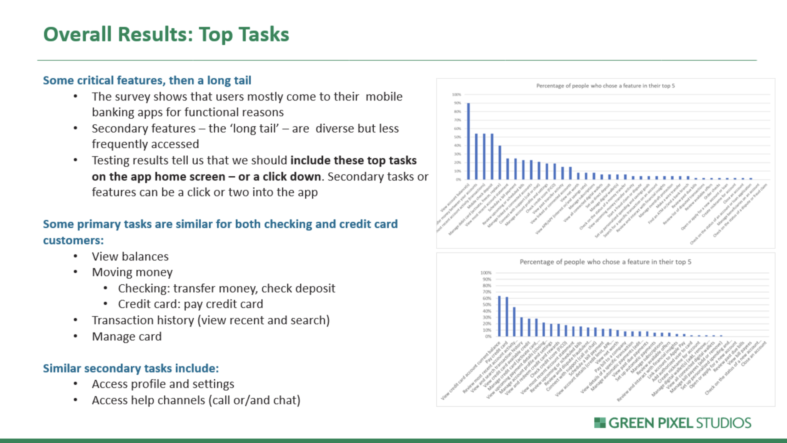
Top Tasks results
What’s familiar to our users?
Based on prior research, we understood that users often maintain accounts with multiple banks. They prefer not to relearn terminology and feel more comfortable using familiar day-to-day banking features. Additionally, we recognized that users are adaptable and can learn new concepts if it enhances their banking experience and efficiency at performing key tasks. Competitive analysis helped our understanding of users' familiarity with features and terminology, ensuring we only introduce necessary changes that add value. It also helped us identify industry trends and opportunities for improvement.

Proposed design options
Bottom Navigation:
I consolidated all money movement functions under a single tab, allowing us to relocate the hamburger navigation to the bottom. This achieved three goals:
Customer Goal: Moving the button closer to users makes it easier for them to reach with their thumb.
Technical: Converting the navigation from a drawer to a full screen enabled developers to utilize framework best practices, establishing a clear navigational relationship between the menu and next-level pages and highlighting the user’s location within the app.
Business: It paved the way for eventually adding more permanent features to the navigation that the business had long been looking to develop.

Bottom navigation - future state

Quick Links
Leveraging concepts from another team and our research findings, I designed a customizable set of quick links for the account summary page. This allows users to keep their most-used functions just one tap away, while also providing flexibility to create a unique experience based on each specific user type's available features. Additionally, I proposed quick links for the account detail pages across various products.
Validation
We have run in-person lab sessions, as well as unmoderated sessions to ensure that the users are comfortable with the proposed changes.
Results
As a result, the team has delivered a design for a streamlined, scalable navigation architecture that would create a consistent experience for all users regardless of their product relationship with the bank, and allow for growth as new features were developed.