
Citizens Access
develop a brand new standalone native mobile app for the customers of Citizens Access

PRoblem
At the end of 2019, Citizens offered a new experience to their customers through an innovative web application called Citizens Access. Rapid growth in the usage of this new platform brought in new challenges that required modern solutions to keep up with the growing demand for mobile banking - the users demanded a similarly modern and innovative mobile experience.
Team
The team has consisted of 4 designers integrated into 4 engineering teams, and a principal lead (myself). We were also supported by the senior director of UX, our research, copy design, and ADA partners, as well as our design engineering team.
Role
My role was to define the new native mobile experience, create app architecture, and develop a unique look and feel for the app.
Challenges
The lack of association with the main brand raised concerns about brand cannibalization, but full alignment would create confusion among users, many of whom have been customers of both the main brand and this digital-only offering, so we had to find a creative solution where the UI of the app made it feel like a distinct subbrand, protected by the reputation of a larger brand.
Process
Discovery
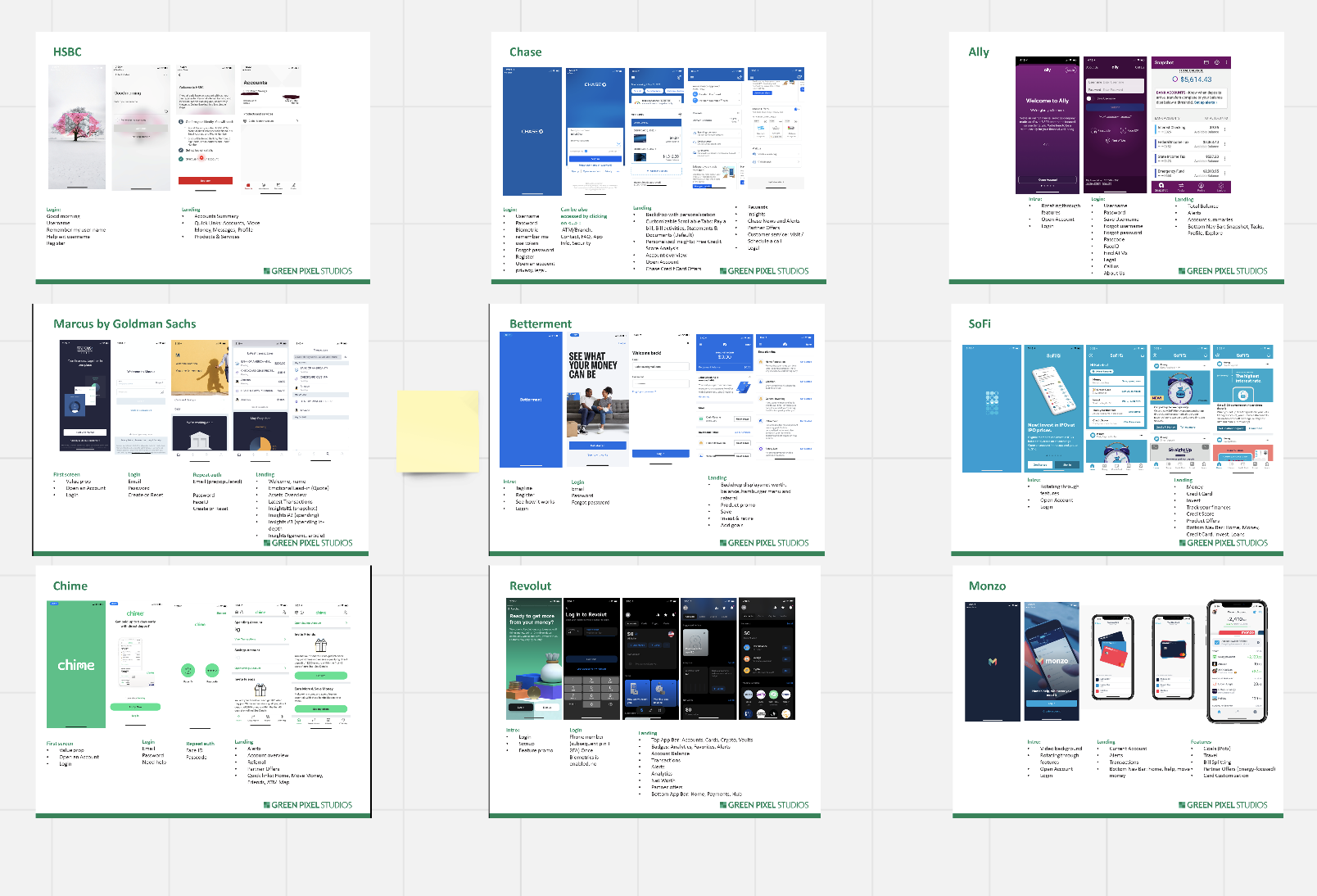
Sometimes, technology creates opportunities. Such was the case here when we were tasked with creating a new mobile app supported by a new and advanced framework, which finally allowed for virtually any experience to come to life. In the initial part of discovery, I have collaborated with the Senior Director or Design in a series of working sessions that would help us capture what the business requirements, learn our competitive landscape and ultimately come up with a vision for the future app.
Focus on the delivery
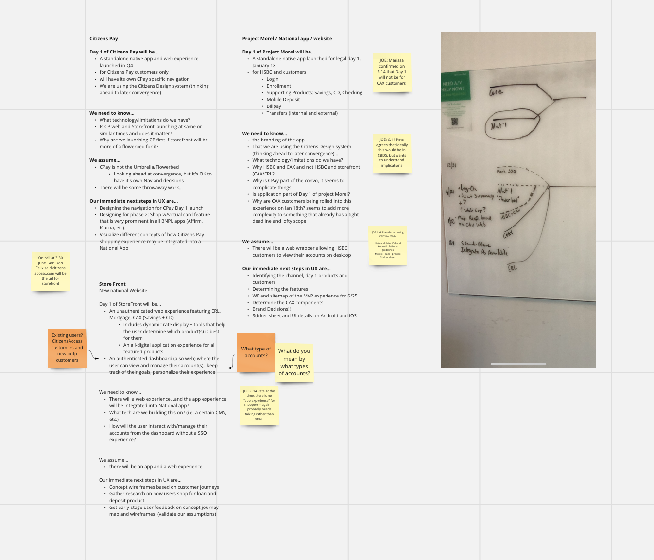
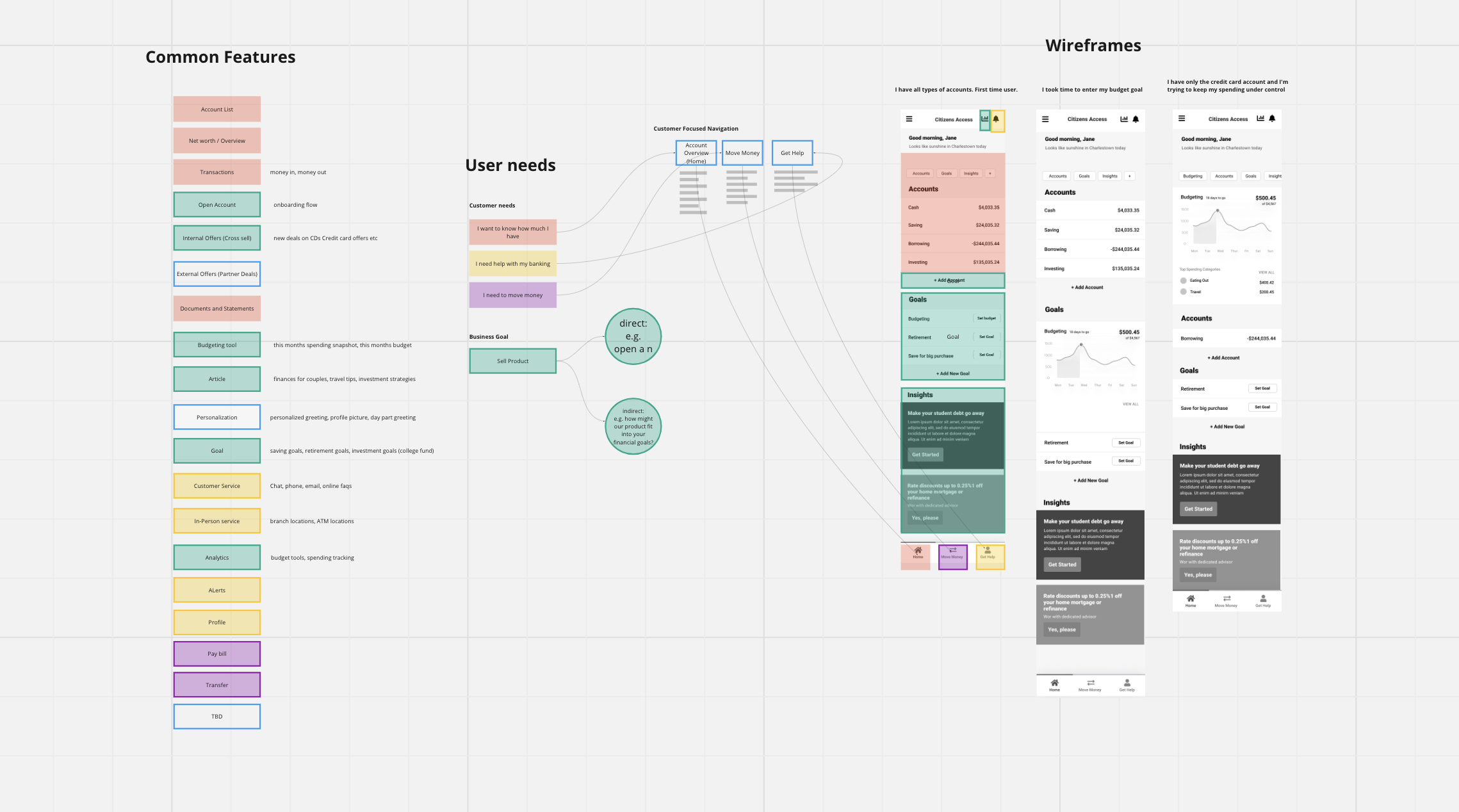
After successfully completing the discovery, and having a better understanding of the possibilities as well as business goals, I have collaborated with business and technology partners to define what features will be available for users on day 1, and how can we build this architecture in a way that the app can continue to organically evolve as it gets more mature, without a need for any major overhaul.
Establishing processes and delivering designs
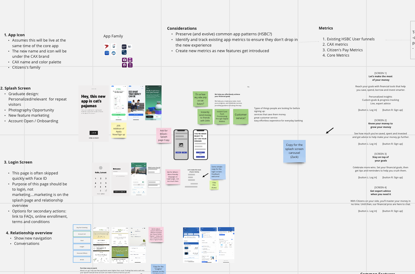
To ensure we are delivering a best in class exprerience, we ensured constant involvement of research, copy design, and accessibility teams. This allowed us to base decisions on data and deliver pixel-perfect, tested, ADA-compliant designs. Aligning with 2-week sprints posed challenges, but we established a UX process fitting into the agile framework. This process included a mandatory discovery phase, low-fi and hi-fi designs, usability testing, copy design, and ADA annotations. Designers also analyzed existing functionality against industry standards and best practices to determine whether the current experience can be leveraged for efficiency or something new needs to be created. This approach was universally adopted, resulting in data-driven, pixel-perfect designs for every feature.
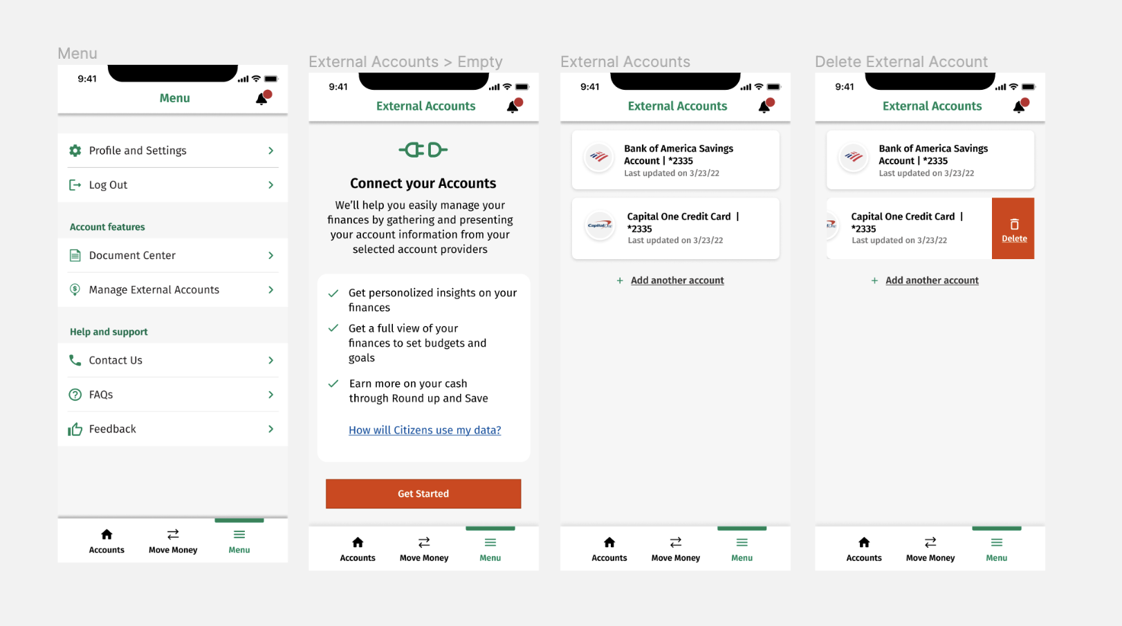
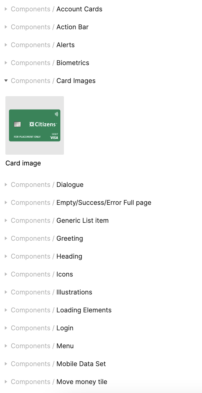
UI Kit
Ensuring consistency
In order to support the designers that were working across multiple team, I have initiated the development of the component library, and provided oversight to ensure the designs followed the established conventions. During frequent design reviews, I encouraged designers to submit any new components to the UI kit, which gradually became the foundation for the core mobile UI component library.
Results
In a little under a year, we have released a mobile app, which despite of its fairly limited functionality now has a 4.7 App Rating in the Apple App Store, servicing over 100K users monthly.
Aligned iOS, Android and web experiences to align with design system improving design and development efficiencies, and reducing number of hours required to produce new designs by 50%.