
Citizens Mobile App UI Refresh
Refresh of the core mobile app to align with brand guidelines, the design system, and to create a more modern look and feel

PRoblem
The Citizens Bank app exhibited a fragmented and inconsistent user experience. Users have continuously indicated that they find the app’s look and feel outdated.
Team
There was a single pod (product owner, iOS and Android devs, QA and backend API devs) devoted to this effort, along with myself (principal designer), pod designer (reporting to me), and ongoing partnership with the research and copywriting team.
My role
Developed design strategy, established processes, managed design resources, was heavily involved in planning and cross-team alignment.
Challenges
The biggest challenge in a project of this scale is aligning timelines and processes across 20 other teams, and at least 12 other designers, supporting the current experience. Coordinating efforts with such a large number of teams can lead to complexities in communication, decision-making, and overall project management. Each team had its own priorities, workflows, and deadlines, making it difficult to synchronize efforts and ensure a cohesive approach to the redesign. Additionally, different teams may have varying levels of experience and expertise, which can further complicate the alignment process. Balancing individual team needs and expectations while maintaining a unified vision for the app's redesign required effective planning, communication, and collaboration
process
Understanding the current app

Sitemap / flowchart
When redesigning an app in-flight, it is key to understand the ecosystem in which all app elements relate to each other, both from the users’ standpoint (functionally, visually) and also behind the scenes (which API calls are triggered where etc.). During this stage, we have worked on documenting the current app architecture, analyzing screen by screen to understand what exists today, During this stage, we have also established relationships with all the key stakeholders (business, legal, compliance, brand), and teams that might be impacted by our work.
Redesigning key elements
Following our comprehensive review, we identified several key elements that define an app's look and feel, as well as recurring elements we prioritized for attention. These critical components, such as the header, navigation, and account cards, needed validation across numerous use cases due to their significant impact.
Research and validation
To ensure accuracy, I designed multiple UI variations, and conducted multiple rounds of user testing, and preference testing.
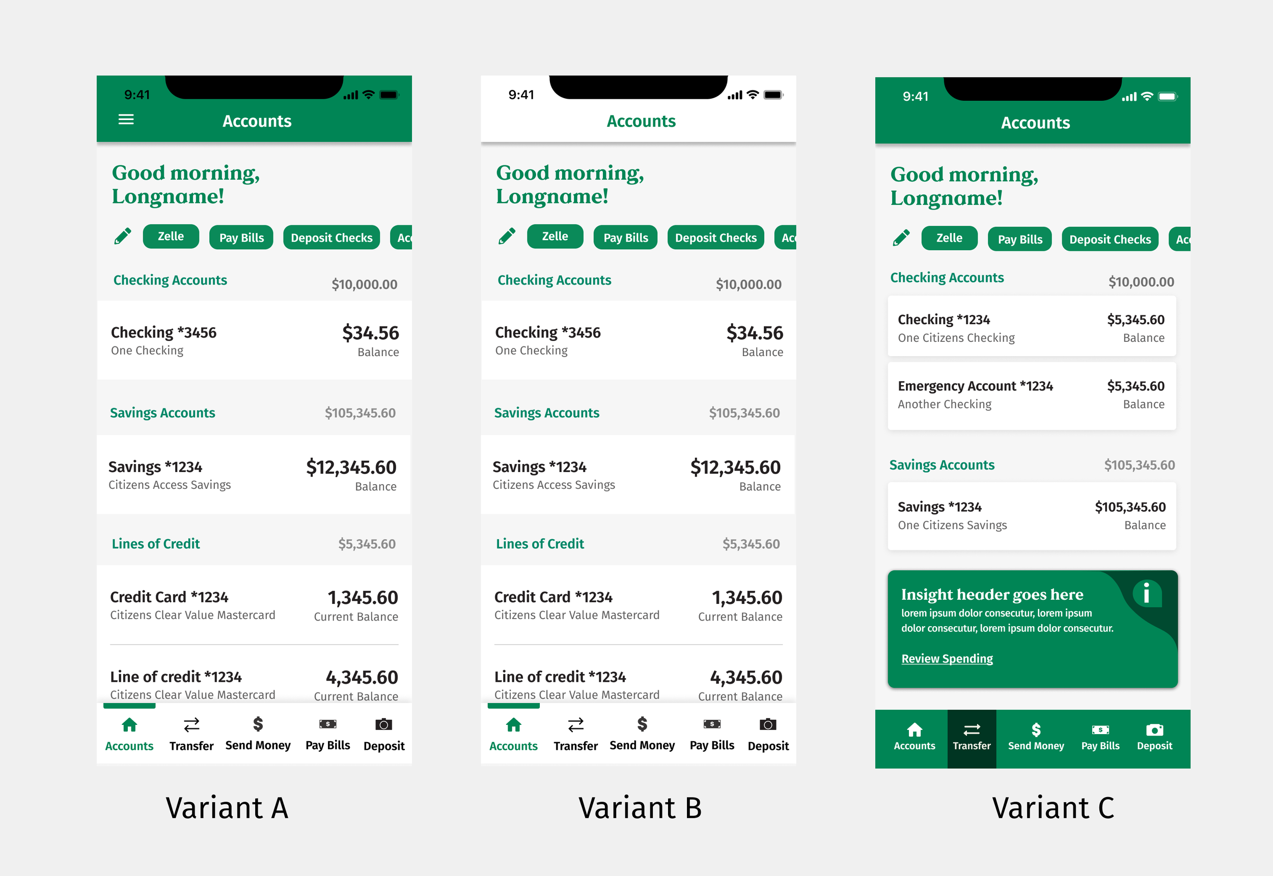
This work helped me establish a set of key elements that would impact the overall app aesthetics. Redesigning these elements first to ensure they align with brand, ADA, and copy design guidelines, helped us introduce the refreshed look and feel without impacting user experience.
Redesigning specific flows
After establishing the key elements and patterns I transitioned to a more supportive role. I managed a team of designers tasked with applying the newly established patterns to the remaining flows throughout the entire app. I established processes required for efficiently designing, reviewing, and approving changes. Additionally, since we had a unique opportunity to look at the entirety of the app, I wanted to make sure we use this momentum to work towards consistency.
Example of a happy path flow for bill pay
Each updated screen would go through a copy design team review to ensure consistency in voice and tone.
We reviewed VoC data for each flow we touched to eliminate prominent user pain points.
Additionally, we identified and rectified a substantial number of technical defects. Furthermore, we introduced a token-based color system, reducing the app's color palette from 120 to just 14 distinct colors.
Establishing component library
To ensure adherence to the new UI patterns we've established, I collaborated with cross-functional teams to establish a working group dedicated to developing a unified mobile app component library. This team comprised two front-end engineers (iOS and Android), two designers from the project, an in-house ADA expert, and our design system team. Over a period of 4 months, we collectively developed more than 50 iOS and Android components, along with approximately 10 design patterns.
Aligning the larger team to incorporate the new design patterns into their flows.

Despite the fact that much of this work commenced after the standards had been established, it remained a continuous effort throughout the project's duration. I conducted weekly calls with the entire team of product owners, engineers, and designers across various product areas, enabling us to share progress, receive feedback, and mitigate any potential impact on the existing user experience while minimizing rework for other teams. Once the component library was established, we conducted smaller sessions with specific teams to help them understand the new UI and provide resources.
Results
Over the 4 months, we have updated over 120 screens to make improvements across main usability heuristics and made changes to look and feel.
Established a new Mobile Design UI kit that relied on the global design system enabling designers and developers to follow established guidelines and promote consistency and standards, efficiently delivering consistent experiences.
4.7 Rating on the App store. Some recent reviews say:
⭐⭐⭐⭐⭐ “Much better look to the eye. Very User-friendly”
⭐⭐⭐⭐⭐ ”Citizens bank has a user-friendly app. Love it!”Removing some of the user frustration related to the outdated experience, we were able to hone in on the next biggest issue to resolve, which is the login errors and overall latency of the app.